Take. Rule. Ascend.│Crún announcement & devlog
Welcome to a special blog post, as it marks the announcement of a project that has been in the making for quite some time, but only now it managed to reach a significant milestone. Will drop the announcement video first (see below), then will explain how it all has come together, what were the challenges and what the goals are for the future.
Table of contents
- Introductions
- About the game
- Please be simple
- What to art
- Simple =/= easy
- Devil is in the details
- Core gameplay
- Making things work
- Where to?
- The meaning of it all
- The Announcement
1. Introductions
The project is definitely more on the odd side of things (although that’s been a staple of my work), as a lot of external factors contributed to its creation, more so than usual (if we can call my circumstances “usual”). Despite that the idea of it all was in the making for years (would call it slow “cooking” rather than methodical and rigorous planning), whilst very little progress has been made beforehand, even though this is not a magnum opus (or an MMORPG or anything grandiose as such), just a “simple” text game with some 3D elements sprinkled on top. Yet it took a lot of time to think about it.
There was a similar discussion not long ago, where folks debated how game concepts come to fruition, and when do people decide to start working on their game. Have shared my experience, and whilst doing so, also touched on the matter of “tackling a project after a whole lot of preparation has been made”: If you’re aiming to make a living out of making games, it’s not a bad idea to think about what you wish to do first, then make your own due-diligence per se, and then start working on something that has a slightly better chance of succeeding (especially if it’s your dream game, which seems to be quite the common among beginners); rather then just jumping ship with whatever you’ve come up with. It may work, but if there’s a way to increase your chances then why not do something about it. Right?
2. About the game
Crún is an Interactive Fiction meets Kingdom Manager type of game, set in a medieval fantasy world. Sort of a blend between storytelling and carefully selected mixture of genres and minigames. The game revolves around being unexpectedly bestowed to rule a kingdom and face the many challenges that the people might bring forth to you. Whilst facing your inner demons, keeping the realm as a whole and out of harm’s way. Knowing that not everyone will be in your favor, and that the consequences of your actions might have a greater influence than one might think. As those are solely responsible for turning the wheels of time, and bringing this world to life.
3. Please be simple
For this next project, the goal was to make as small of a game as possible. The emphasis on it being “simple” weighed heavily on my shoulders, after going through a lot. Needed something that could somehow rekindle my enthusiasm, and possibly make this whole gamedev “experience” worthwhile (finally), and rather soon. As any form of acknowledgment is yet to come, as it has become an uphill battle on all fronts these many years to justify my creative visions and my place in the creative world. Have never thought that it would be this difficult to let your voice heard; regardless what form of art you wish to do.
That being said, making something simple is more difficult than it sounds; especially if you wish to be different about it. Waaay more. Not just from a design perspective, but from a business angle as well. So much so, that if you’re aiming to do this professionally, your options are quite limited (from my point of view anyway), in terms of where you can sell and advertise those (generally speaking, especially true when the production has no budget): You could either go mobile and somehow monetize your game (like ads or In App Purchases), or be lucky enough to develop for console, or find other means of support (like Patreon), or anything in between. This is important, as certain genres play well, or more or less are exclusively played on certain platforms. A practical example would be that generally PC players don’t play match 3 games on their desktops, it’s more of a mobile only thing.
However, apart from choosing your platform (which in this case had to be PC only), the other issue of discoverability comes into play with marketplaces. As generally, once your project is uploaded, very little to no marketing will be done in your favor (say on Itch.io). This is when people often mention Steam as an outlier, where if a game is successful enough, it’ll be listed on the front page (either by the algorithm or by curation), or be listed in global/personal recommendations; which means a lot where you’ve 120 million users per month. But not everyone can afford the logistics to be listed on Steam for example …
Then there’s the issue with customer expectations, that if you make say an updated Pong clone, chances are nobody will play it, because either it already exists in the form of a million copies (by other devs), or just not exciting and catchy enough. As times had moved on since, and such simplistic designs are rare to provide decent entertainment for others (if so, it’s usually packaged in a careful way, say with gorgeous aesthetics and fast paced risk & reward systems). Let alone know about it. Steam is coming up to have 70K games, and the Playstore to 480K! If this is not a competitive scene, then not sure what is. 
Then there’s the thing with marketing: Even though, having been around for a while (curating my dev related content that is), doing this whole “gamedev” thing and all proved to be more difficult to amass followers than previously thought. Some of it was due to the lack of clear goals with each project (like jumping ship as people lost interest in those, and thus not being worthy to work on), or not being “there” in terms of quality in the past (still learning the tropes), or not being vocal enough about my work (aka. marketing it proper). Which all were causing serious issues, when you were hoping to promote your product and reach certain milestones. [Just to give you an example: Did you know that one of my biggest projects has an hour-long soundtrack on Bandcamp? Hm, No? Well of course not! Don’t be silly! Nobody does, because nobody heard about it. And those few who did, only glanced at it, skimmed through some of the songs, shrugged their shoulders and left without a trace. They either weren’t the target audience, or the music was just that bad. This just shows the true power of quality, reach, marketing and prestige.] This all meant that with each project, the next one had to be that much better, or at least offer something novel, or whatever extra, to justify its existence (hence that last crazy experiment). Cannot even begin to explain how stressful this statement is (which is both detrimental to your physical and mental health in the long run).
So-o the question remained, How to make something that is simple enough to make (doesn’t take years to produce, well at least to a point where a demo could be made; but still), looks nice and ticks most if not all the boxes? Whilst finding a way to balance/optimize your resources as a solo developer. Where nothing can be done with utmost perfection (as envisaged), because something always has to require more attention than others (the “you can’t have everything at the same time” dilemma). And as someone not in the luxurious position of doing whatever they want, for however long they want, this proved to be quite the headache for years and years; in fact my entire “career” so far.
Simple games that have only one or two mechanics going for them, from my point of view, can only do so much (depending on the context that is). Fun for learning the tropes (for beginner devs), but next to impossible to turn them into something profitable, mainly because of player expectations. Also, the simpler the game, the harder it is to keep your audience entertained (and more so require careful tactics to maintain, like introducing the ability to create content in the game, or bringing it into the realm of multiplayer, and so forth). So in my case, “simple” meant turning it into a form of a “streamlined” process, with a scope that is both flexible and hopefully doesn’t get out of hand. Thus having a slight chance to be able to serve the extreme expectations along the way.
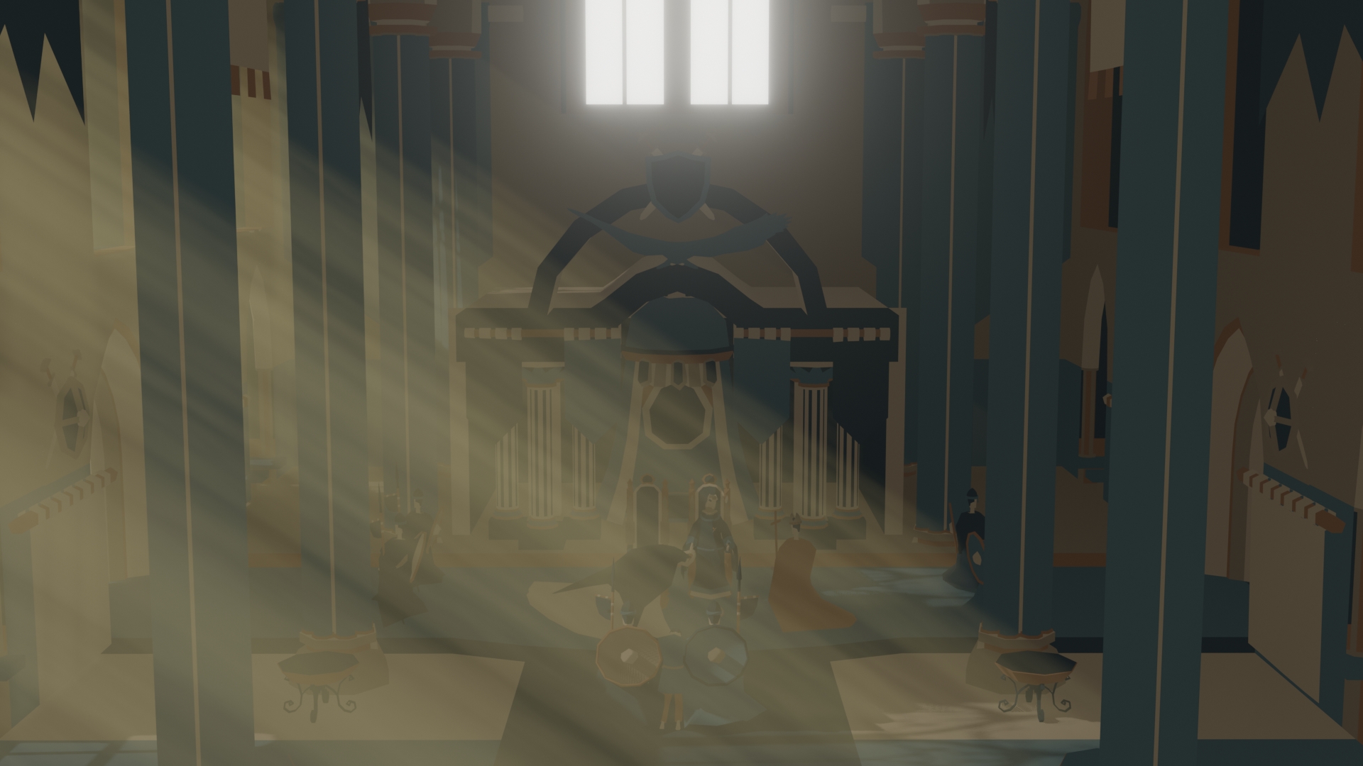
That is why have ended up returning to one of my earliest attempts at text games (it was an interactive fiction (IF) title with lots of hand drawn pixel art, which in all was quite taxing to produce for not being proficient enough), but with a slightly different approach this time, as something needed to be done quickly, and was out of ideas (strange thing to say, but life pushed me into a corner where my creativity simply didn’t find time to exist). However, it quickly came back to me, the many issues that my previous game suffered from (like lack of cohesive direction, improper reach, etc.), and the whole thing with not being able to solve “this” conundrum (the how to make a living from text adventures) for more than 5 years; for one reason or another.
Also knowing well that others had and still manage to make story heavy games (like Disco Elysium) aided me in my renewed attempts at figuring out the root cause of my previous failures. Will spare you from the details to not bore you more with this whole monetization dogma (which is pushing this whole narrative), but suffice to say that just after a few days, it all started to come together; the master plan that is.
As a solo dev, one of the most difficult things to figure out has been to make do with what you’ve got, and to bring the most out of it (like when weeks were spent to render a simple background for a previous project). Oh and figuring out a way to that “optimal” state of player retention, in the form of execution. This is important, as the difference between “done” and “done well” could be day and night. Which could make or break a game as a consequence. This is not much of an issue with games with a lot of content and things to do (even when there’s nothing going on), but the smaller the scale the more creative you must become to be able to minimize downtime for the player (where they do nothing and feel bored because the game doesn’t provide for them). Hence the decision came to bring this new adventure into the realm of 3D, sort of mimicking what visual novels do with their style (having a more visually pleasing look that is). Because, at the end of the day, staring at nothing but walls of text can become jarring to say the least.
That being said, this wasn’t just it (although having art in a game is hugely underestimated, in terms of what it takes to make those), as one of the other issues with my last IF was how stories were (generally) structured. In order to create content for IF, there must be a thread that the story follows (loosely), leaving to all sorts of interesting avenues where the story can be linear, cave like (bunch of narrative branches with seemingly no end), or whatever else (there’s a bunch more of them), which can quickly add up, and cripple production if not careful. That’s one of the reasons why choice games (usually) fake depth, or straight up dismiss player actions, drive them to artificially created paths or junctions, and so on. Simply because you cannot give the player the absolute freedom to do every possible combination (like in an action game), as every path needs to be written out and designed. To put this into perspective, around 10 minutes of gameplay (from that previous IF project) took a few months to write. Months for a miserly 10 minutes of gameplay! And as content is the backbone of story rich games, anyone can clearly see that this is a major obstacle, and cannot be easily maintained.
Furthermore, was looking for ways to enrich the reading experience by giving more power to the player, and giving them more leverage to their actions. Thus, somehow all this came together with some of my previous work (like handling progressions in an interactable way) in the form of a plan, on which work has begun immediately. 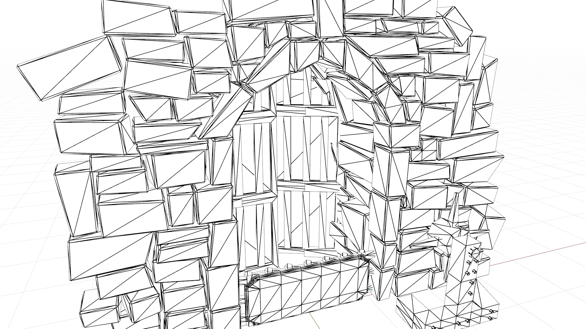
4. What to art
After parting from my last (and arguably crazy) experiment (which meant to be that way, actually), due to lack of incentive from others, there was this void of not knowing what to do next (let's just call it panic; as nothing has proved to be enough over the years). More or less, this cycle of booting up a project then dropping it for not being able to meet expectations continued (usually spending around a year or so on average, thousands of hours before scrapping a project), which left me with an increasing doubt that “maybe”, maybe this whole idea of solo development may not be such a good idea after all (especially for not being a programmer by trade). It started to cross my mind more regularly that maybe my best will never be enough, and that my goals will forever be just a dream.
My whole work environment (old and scrappy), the constant pressure from crunch (haven’t had off time in more than a decade), and the lack of any other ways to finance any of my projects (either by not having access to/afford platforms, say Steam, or not having a track record for a business approval, say by investors or publishers), meant that whatever there was to be made, had to overcome this massive handicap. Essentially needing to create something spectacular out of the gate. Which is saying that you’ve to create something truly eye-catching or at least interesting to look at, borderline viral from day 1; out of thin air. Thin air! Well in theory that is… Keeping in mind that wanting to fly to the Moon with sticks and stones will only take you so far. You can compensate up to a point, but the more you try to mimic the real thing, the more time has to be spent in order to make it close enough to work, which hinders progress by a lot.
[Although loved the art direction of my last experiment, the hand painted style, that is, it left a bitter taste wanting for the proper thing (a digital pen and tablet), because of how difficult and inefficient the whole process was with a mouse (especially to “fake” the brush pressure, took over 2 months to draw some textures). Also, coming back to my old IF game when was drawing pixel art, it took days to create one picture that would appear on every other page, for a fraction of a moment at most. Not so productive enough.]
For one, the need to strike a balance between aesthetically pleasing and quick to produce (in a crunch environment) won me over, hence was debating my options of what my next project would look like. Wanted to do something less ambitious than last time, but still striking enough to be noticeable. Unfortunately, this was more of a business decision, than a creative one, as a lot went through my mind at that stage. A lot that had very little to do with creative freedom, or my artisan abilities, and had to do more with marketing, presentation and product assembly (the “metagaming” of the game dev world) within the limits. Which is suffice to say was not a pleasant thing to do.
This was the reason why the game has this cell shaded Low Poly (LP) look to it, with an extremely limited palette (5 main colors, plus the tint from the shadows). Although was worried a lot about the artstyle (as this is still in debate), as it might come across as cheap and frowned upon by others. As well as not living up to my (sky high) standards, having to compromise on quality and execution that is. Anyhow, managed to do a couple of art tests before deciding that maybe it’s a path worth exploring. LP has a charm to it, but not everyone is as open for liking it as one might expect. Plus it can easily look absolute **** if made with no taste or intention.
The irony of LP is that in some cases, well more so than some, it’s more difficult to produce than say a more detailed (and modern) asset: Simply because you’ve less options to hide imperfections (such as edge flow, or lack of tasteful “direction”), and the form has to be that much better (e.g., this is the point where artists usually talk about the importance of having a good silhouette). Luckily, have been making LPs for some years now, so that wasn’t too much of an issue, yet it still challenged me to create something tasteful in just a short amount of time. [If you look at LP models from the web, you’ll see that generally there are arch types out there which are either super blocky (almost like having bits of voxels placed on a character, but with simpler object), borderlining mid poly (something that looks like as if it was “downgraded” in terms of polycount from a much higher one like a sculpt, whilst trying to keep its shape), or look something out of Minecraft (the “cardboard box” type); or in rare cases made up of simple pyramid like shapes.]
Last but not least, was debating (before choosing the cell shaded look) if there should be textures applied to the models or not. It was obvious that hand painted ones were out of the question, but from another game idea from a few years ago, there was this one gladiator model that was made with the sole purpose of wanting to add pixel art textures to it (bringing you that classic era feel); which made me consider other options. However, once again, was thinking about perception, time and emotional impact of the assets. It’s a hard to swallow pill, but making aesthetically pleasing LP models with equally matched pixel textures requires a lot of time and dedication (weeks).
Especially if you’re hoping to mimic the aesthetics of older systems/art (simple tasks such as unwrapping models, to be pixel perfect can take several days). This has to be kept in mind, as most people have a bias towards high resolution/stylized graphics these days (part of how technology progresses with each generation), thus using techniques from the 90s could look awful if not done well. [This is where modern lighting, ray traced that is, can shine, and breathe new life to old techniques.] Again it circles back to either “faking” it (by using real life textures and downsampling those and making them pixelated) or doing it by hand (by placing and drawing each pixel); or perhaps using procedural techniques. Placing pixels is equivalent to brush painting, where you’d need to paint shadows, highlights, and so forth, on one single texture (these days most information, such as light values, surface details are separated from the main texture, the approach is called Physically Based Rendering, PBR for short); meaning that the turnover for one asset could take weeks/months. Which sadly is not an option for me at this stage, as the pressure demands quick progress at any cost. [This is one of the reasons why specialty tools for professionals are made available: Not necessarily to produce better art, but to do their tasks faster and with more efficiency.]
5. Simple =/= easy
One of the main reasons why it took so long to greenlight this project had to do with figuring out how to turn the seemingly simple concept of a text game into something that could work (better than my previous attempts that is). This is where the method of execution came into play. Technically, you could whip up this whole game in a weekend and call it a day, but wouldn’t have any of the “je ne sais quoi” that could make this project special. Apart from the apparent (like the visuals, or the mechanics), there would be a great chance that the final product (speaking of gameplay, direction, etc.) would be lacking. But wait, you’d say, Games have done this whole text thing before, so what’s with all the fuss?
As explained before, when you limit your project to a certain degree, a whole lot more effort needs to be put into all sorts of minor things, otherwise the project simply won’t be recognized by anyone (this is also true for fighting the many algorithms); which is generally reflected in social interactions on the web. Solely because the less is happening on the screen at any given moment, the more the player’s eyes begin to wander and eventually find issues with your game; like getting bored. To somewhat counter this phenomenon, suddenly the smallest of details, such as menu transitions, could become the center of “action” as (in a text heavy game, especially) there’s very little movement happening at any given moment (usually that’s the reason why visual novels add effects such as “sliding” to their art). Which can point out the flaws in your design to a much greater extent. Finding this sweet spot for flow, from one point to another, and paying attention to all as well as the details was a fundamental roadblock that needed to be solved first before tackling this project.
6. Devil is in the details
Finding the element of “fun” in the simplest of things wasn’t the only issue. A major concern was figuring out a better way to deliver the narrative to the player, to make it more palatable and streamlined. And to decide on what the subject would be (this case it was the theme of managing a medieval kingdom), whilst making it re-playable in a way that doesn’t feel too repetitive (fostering New Game Plus). Also maintaining some form of authorship over the work, and not let it become total nonsense by procedural generated content (which could’ve been a task on its own, and probably outside my paygrade).
Then there’s the thing of knowing your target audience: They are more on the side of ardent readers, and as such, their expectations must be managed first before everything else. However, getting their acknowledgement won’t come easy though, as personal taste and previous experience (among many other things) plays a huge role in this field (in writing, not just in video games), especially for the more seasoned. Which translates to the fact that people are more prone to be critical of your work than in general, and more reluctant to dive into an unknown author’s work. This could simply come from fatigue from abundance (choice paralysis), or from having be susceptible to varying quality of art, or just having a form of “prejudice” against anything that’s not mainstream and consequently “tested” by many (the classic “word of mouth”, which is apparently, according to my research, is extremely important in the world of IF).
Whenever you wish to build a name for yourself, often the hardest thing is to gain the trust of others. This is especially true for someone with no “street credit”; which is understandable to a point, yet a huge bottleneck for aspiring folk. [Some time ago blogged about this, how in a way art is not just a product of our perception (as we all know it, fueled by taste and other cultural preferences, etc.), but the perception of (or lack of) intrinsic values. And how, more often it’s a funnel for ideas and strict control mechanisms from well known venues/institutes/groups, who dictate what can and cannot be called art. Then there’s the role which it plays in discoverability and organic growth. This is why so many talented artists never get discovered, as luck and connections often play a larger role than it should.]

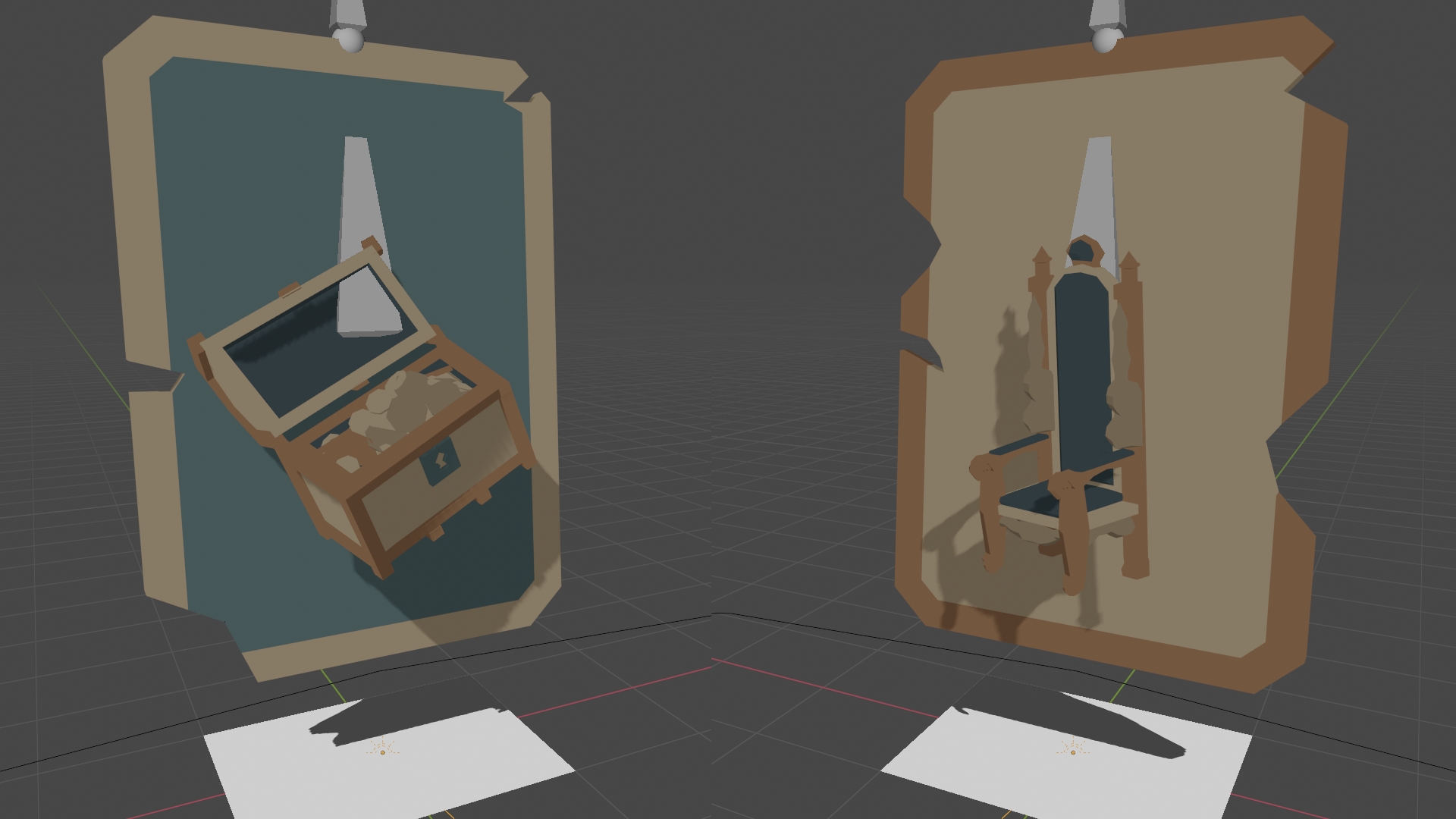
But let’s get back to the technical aspects of making all this a reality: Not many will notice, but there’s a small minigame in the main menu (with the crown and the trap shown above), which took a solid 2-3 weeks (maybe more, forgot) to figure out and test. It was a crucial step in the making of the game: It’s one thing to say “replayability”, another to implement it. Part of this was handling randomness in general (which came in the form of “when will the trap close”). Not a mathematician, far from it, so excuse my simplicity in the topic, but there are several ways to handle and calculate an outcome (like for simple coin flips, or assorted bags with calculations and statistics), which all contribute to a set of perceived experience (in this case) for the player. Which is why simple mathematical methods rarely yield good results in the long run, as they quickly become a source of frustration for not being “fair” enough. So finding a better way to offset, and have more control over what the outcome will be for any specific random event, was the goal of making that small minigame with the trap (alongside serving as a small distraction within the game). Suffice to say that now that system is the foundation of all others; very powerful stuff in the world of text games and beyond. [Handling randomness/chance should be given a bit more consideration in some cases, as it could fall flat if not done well. Take the famous missing with “95% chance to crit” as an example (from tactical games).]
And let’s not forget that everything had to be designed from the ground up, and planned out in a way to have a chance at making all of this fun (#soon). Answering questions to “How will the narrative be presented?” or “How will the player interact, or make decisions?” or “In what ways their actions can affect the game?” or “How will it be saved and used later?” or “What mechanics will support the narrative and choices?” and so forth. Could go on and on about this for a while . . . But when you think about it really, the core concept is nothing more than just a “simple text game, set in a room, where you make decisions on the fly”.
7. Core gameplay
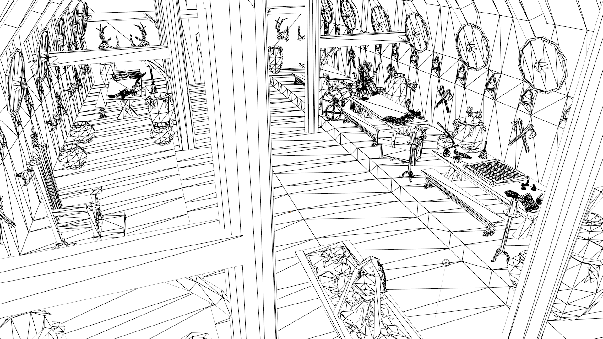
As mentioned in the video the main loop of the game is to be in the position of a royal, in charge of a kingdom, where problems and issues are needed to be solved by the day: The player welcomes a character to their courtyard, talks to them and makes decisions based on their actions/topic. Everything on top, the managing of resources or handling other tasks, is just the icing on the cake.
The main focus is on bringing believable characters to life, ones that have their own personalities with their own agenda. Although the actors have no face, they are aiming to be as expressive as possible; this is one of the reasons why all actors are AI controlled in the first place.
Characters can represent individuals, groups of people (say all from the realm) or be a part of the player’s own psyche*. Say you may come across a Merchant who’s complaining about a petty theft, or a more striking example where a woman carrying a child approaches the throne, who may represent your entire kingdom tarnished by feminine. The direction of the conversation will determine (in this case) how your kingdom will operate; as certain decisions will have their own effects. Technically, this is why all the other offices exist, to be a place to manage and somewhat influence topics (and consequently choices) that could come up during a conversation; otherwise would have to cram everything into one scene, which is not the most user-friendly thing to do. This way, you’ve the freedom to decide, at a whim, to check on any of the additional subjects (like the treasury or production) at any time during the game; provided the character associated with the office (say the Merchant from the example above) is not currently engaged in a conversation. Essentially blocking the ability to modify circumstances, to gain the system; which would be cheating.
*[Wish to explore the inner workings of the player’s character in the game, as being a royal didn’t always mean smooth sailing, and there’s a lot that could be explored. Furthermore, it presents a neat opportunity to look behind the curtain and leave its effects, as in changes in abilities, in one way or another.]
8. Making things work
Originally the scope of the soundtrack was way more humble (as seen in previous videos). However, after composing the first song, it felt short and incredibly simple for what was first envisaged (with the overlapping musical elements); partially to blame the lack of instrumental libraries. The original goal was to create an authentic medieval experience; but ended up short by the end. You’d be surprised how versatile and difficult it is to compose something that’s of the medieval era (as far as pop culture is concerned, as the middle ages encompass a large variety of music and style, over a long period of time as well, so there’s no one definite style to go after). It’s worth noting that the general modern rules and conventions for composing music just weren’t there (making the music sound more “jumbled”, giving off that authentic medieval vibe we all love), on top of the use of old instruments that are fairly uncommon or non-existent these days. Soo, to alleviate my frustrations of not being able to deliver what was hoped for, decided to spend around 3 weeks (and more polishing later) to compose a more orchestrated form of music (more akin to what people would call classical “fantasy” these days), just to ditch my previous plans and save the production (from not having music in it at all).
Another fun anecdote comes from spending a week or two, figuring out a good solution for camera transitions for the in-game level. While this may sound trivial, this issue has a lot more to it than what meets the eye. Again, this circles back to the idea that if done poorly the player will notice. And then they will notice indeed, as most of the time the player will have to zip back and forth from one location to another. And as there isn’t a free cam for anyone to use (where you can just fly around the level, and hopefully not clip through), a lot more effort had to be invested in making those transitions look nice (non-linear, which looks really bad and bleak if operated in 3D space, as the camera not just moves its location but adjusts it rotation); even the ones in the main menu are overly complicated (although those being linear), though still simple in their nature. Things like this, like fiddling with camera controls can eat up a lot of time, whilst in this bizarre state of being vital for development as well, as these are part of the core gameplay; so to speak.
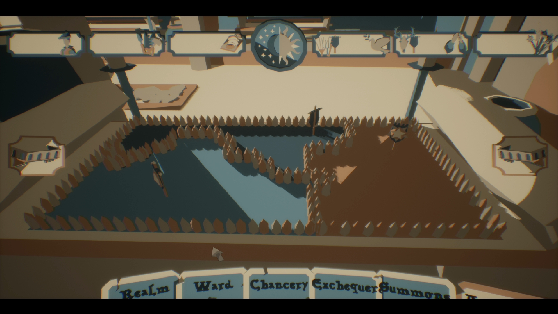
It also has to be said that most of the systems found in the game are designed with the sole purpose of being modular and expandable. Which is more expensive to set up initially, but as time of the essence, it’s worth the effort in the long run. This is especially true with the random map generator. A good week or two was spent on making sure that something that vaguely resembles a map would land on the table (where you can oversee the neighboring kingdoms). It’s not too complicated of a product, have done this before with blueprints (BPs), but it was still a challenge to maintain optimization on such a scale. [The tile size is fairly low, not just because of the LP aesthetics, but handling large amounts of detail can quickly get out of hand using BPs (although have handled massive hexagon tile-maps with moderate ease a few years ago). As the map not just spawns in random bits, but has to evaluate and correct itself when needed. Which is fairly straight with small numbers, but gets increasingly difficult with larger ones (there’s a bug in UE4 where arrays exponentially freeze/slow down the game after a set of items has been reached in an array, that’s why you can’t simply insert a 10K list into the editor, as can crashes it immediately, regardless of “physical” size in the memory) And using tricks to lighten the load can only take you so far (like cutting up the code into smaller bits). In this case it could’ve been fine, as it only happens once, at the first loading of the game, but still, didn’t want to force players to have to sit through several minutes of nothing; for something that wouldn't fit the game at all (for being too detailed that is).]
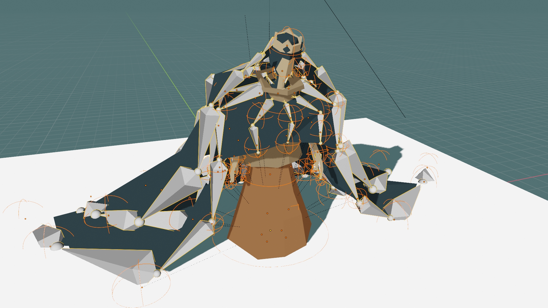
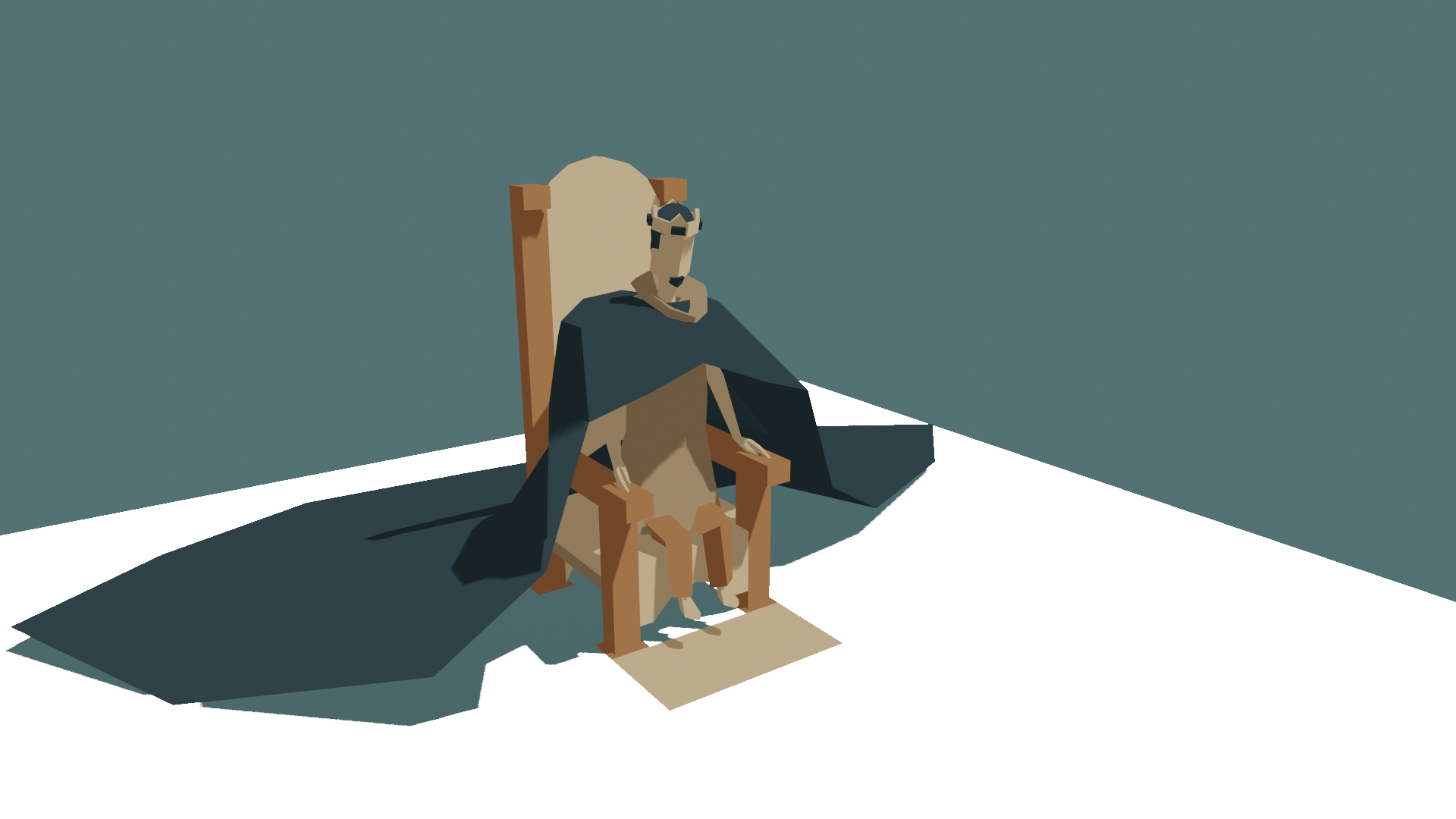
A lot more could be discussed, in terms of design, like how certain elements of the game were made. An example would be the creation of pop-ups that auto-scale (which means that none of those are prefabs), how the trees gently sway in the wind with a simple “weather” system, or how the characters all have one master skeleton (with somewhat of a complicated rig seen above with the image of the Queen). You’d be surprised how much thought went into this, and can easily be missed!
9. Where to?
There are a couple things to fix before continuing, as there were some bits that couldn’t be fixed on time before releasing this update. Minor bugs that bothered me during recording or noticed when editing the video, like the card transitions for the throne (furthest golden card on the right often being late in transition), or the light situation for the benches in the great hall, as you can barely see what’s going on in those (because there’s only 2 lights placed there in the middle at the moment). Or how some items were misplaced (hovering on top of the tables, causing weird shadows), while others didn’t work properly (like in the menu the selection didn’t stay for the characters). Hopefully, those weren’t so noticeable, and didn’t spoil the video too much.
Then, as outlined in the video (with the whole feature set for each “office”) there’s a lot more to work on before the game takes its final shape. That being said, the main focus is going to be on bringing in the first real gameplay element to the scene, by introducing interactable characters (the ones that were shown as a silhouette in the video); as those make up the core gameplay loop of the game (as previously discussed). Won’t be starting from scratch though, as have tested the individual bits before (like with setting up that trap minigame for randomizing, or how the opening cinematic, the one that plays just before you can move around the Great Hall, was made by using AI “routines” and behaviors trees (not scripted or pre-rendered, rather operating by a chain of functions)), so it’ll be just a matter of “simply” mashing everything together (obviously, there’s a bit more to that, like how the AI characters themselves will walk somewhat, and have their own expressions, which needed to be animated first and foremost, then can come coding their part, etc.).
The biggest detail “missing” from the puzzle is (as it only exists on paper that is and have yet to test the theory) the handling of user interactions and how those will be loaded into the game; as have some ideas of routines and features to implement. This part will need a bit of tinkering, as handling data tables could get out of hand easily: Can become confusing to read as a developer, if not done with some form of system in place (like with the other subsystems already in the game). Because often coming back to old code and not knowing what it does is just the worst, like having to reinvent the wheel every time (which commenting can only help so much). It also needs to be both flexible and scalable, much like any other part of this game.
Would focus more on other parts of the game, like fixing the missing menus (no options, credits, or how there’s none in-game as well, so you cannot save the game for example, only hard exit by pressing the Escape button), but the immediate aim is to get to a point where true gameplay could be shown (and not just a facade); something that’s been bugging me for quite some time.
One of the main reasons why the game is being built up from the front, rather than having a Minimal Viable Product (MVP) where there is something to actually play with, has to do with managing expectations (for polish, aesthetics and quality) and my previous experience with development and the industry in general (which skewed my approach towards this form of execution, be it good or not). Some of the latter comes from being susceptible to certain impulses (like how “just” gameplay with no graphics is unmarketable, for me at least, and often infantilized and frowned upon; that’s why some of my older projects lay dormant), while others knowing in advance that throwing everything together without a proper system in place (speaking of modularity, or cohesiveness in code) will cost more time and effort to fix in the long run (essentially requiring to re-write to whole game from scratch), which is not something that appealed to me as a solo developer. Having systems already in place is much more of a choice of convenience, rather than having to scramble when the time is nigh (and hope to fit the different parts together). Or for the simple fact that haven’t had the luxury to do so (because of having to crunch and show progress). Suffice to say that this whole concept is a bit more “esoteric” to grasp, as this knowledge can mostly come from years of experience (and failures) in making games/projects.
10. The meaning of it all
For years, have been an advocate for meaningful art/games that went beyond what’s expected from them, and increasingly viewed as outliers (or worse), thought of going against the trends of modern art/gaming. The aim was, and still is, to not just provide a burst of satisfaction, that is mostly superficial, but with something that lasts a long time; and provokes a thought or two perhaps. That’s why this game most certainly will not appeal to those who are looking for an action packed, high-octane adventure, with the latest graphical achievements, as the main goal is to explore the territory of story rich games.
Although the style of writing is heavily rooted in realism (in the sense of physical reality, not necessarily to be historically correct), it also hopes to be different and even light to enjoy. Much like most of my previous work (be it fiction or not), which was always mostly concerned with immersion, this too will aim to bring the characters and their setting to life.
11. The announcement
Back to the main reason for this blog post. Only now the project managed to reach a significant point where progress could be shown to everyone in the form of a project page and releasing the game as Early Access. It’s hoped, apart from launching the project ahead (because there are big plans for the future for launching the game on Steam, which would require a business to set up in this case), that others will be able to judge the game in its entirety, and experience it for themselves. With the added bonus of alerting me for potential bugs and issues with the game/design.
Crún
Take. Rule. Ascend.
| Status | In development |
| Author | theaaronstory |
| Genre | Interactive Fiction, Role Playing, Strategy |
| Tags | Characters, Fantasy, Low-poly, Medieval, Narrative, Procedural Generation, Story Rich |
More posts
- Will the ice melt?│Crún devlog #3Apr 16, 2024
- Stars do speak│Crún devlog #2Feb 28, 2024
Leave a comment
Log in with itch.io to leave a comment.